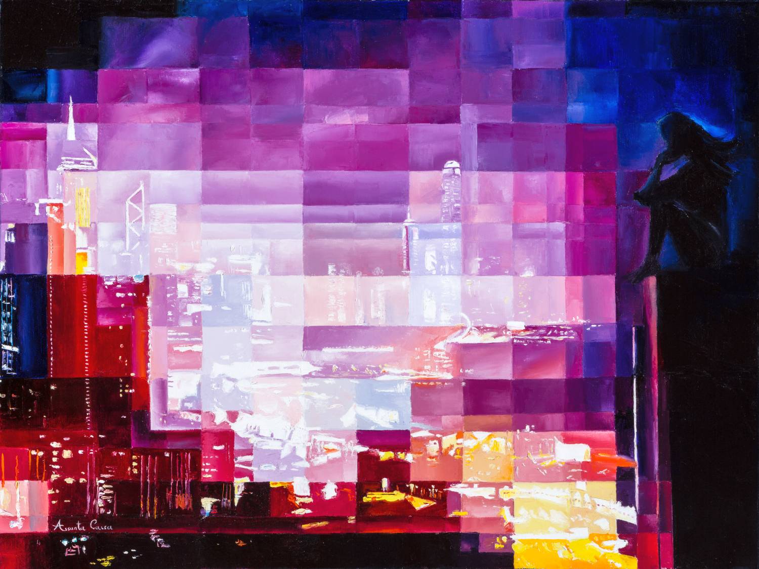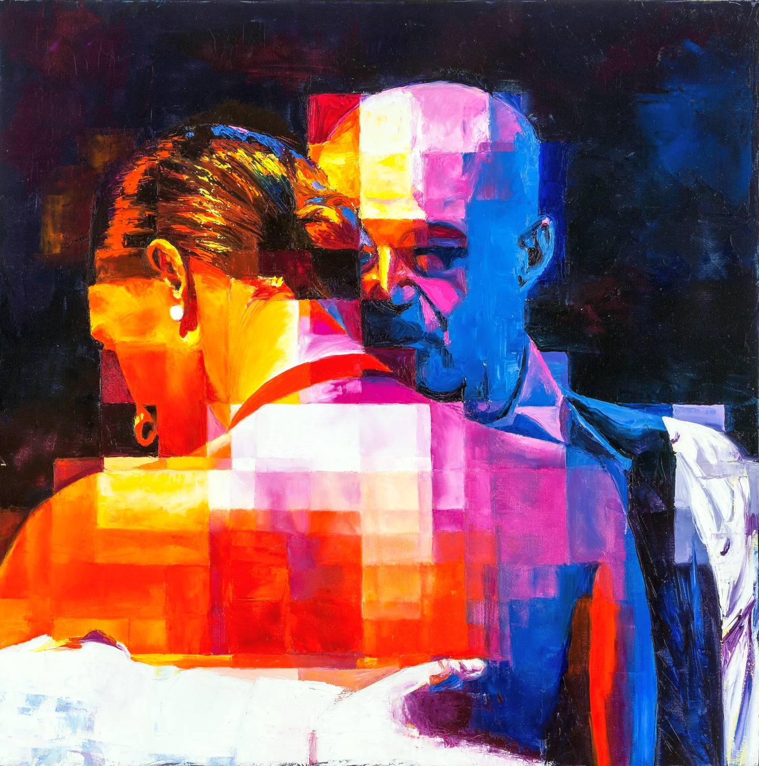
At the core of every artwork lies a deeper narrative—told not only through form, but through the language of color. In “The Embrace”, one of my creations, colors transcend aesthetic function, becoming emotional messengers of intimacy, strength, and human connection.
Choosing the Palette
I selected tones that could embody the depth of human closeness. Deep reds and vibrant oranges express passion and warmth, the pulse of two souls in connection.
In contrast, cool blues and purples introduce calm, trust, and emotional balance. Together, they reflect the dynamic interplay present in every meaningful relationship.


Chromatic Symbolism.
In “The Embrace”, each color carries symbolism. Red stands for the heart, courage, and unbreakable bonds. Orange suggests joy and optimism. Blue and purple invite introspection and serenity, expanding intimacy into something almost infinite.

Light and Shadow
The artwork also plays with light and shadow, built through shifts in tone and intensity. Light areas suggest mutual understanding; shadows hint at personal depths yet to be discovered. Intimacy here is not static—it’s a continuous, living process.
“The Embrace” is more than a painting: it’s a space for the viewer to reflect, feel, and connect. In every color, a hidden story waits to be heard.