There’s a side of the palette that pulses, seduces, whispers. It’s the side of the most delicate emotions—those that don’t speak loudly but stay under the skin.
In this article, I explore three magnetic pigments—magenta, Caesar purple, and cobalt violet—and how they vibrate through my painting practice.
(And yes, for those who read the first part—this is finally the sequel. Time? Just a few solar revolutions. But for certain colors, it’s worth the wait.)

🔹 Magenta – The Heartbeat of Color
Magenta is the rebel of the palette: it disrupts balance, shakes composition, wakes the eye—and sometimes the emotion. I use it when I want to add energy, make a shadow vibrate, or create a strong contrast with cooler tones.
Discovered by chance in 1859, this pigment was first named fuchsine, but was soon renamed magenta to celebrate a French military victory in the battle of the same name, fought in Lombardy. I’ll admit—I find it a bit off-key that such a bold color owes its name to a battle. But maybe it’s precisely this contradiction that makes it interesting.
Magenta doesn’t exist in nature: it’s an optical illusion, a creation of the brain to fill the gap between red and blue in the light spectrum. That makes it even more fascinating—a color that isn’t “real,” but is deeply felt.

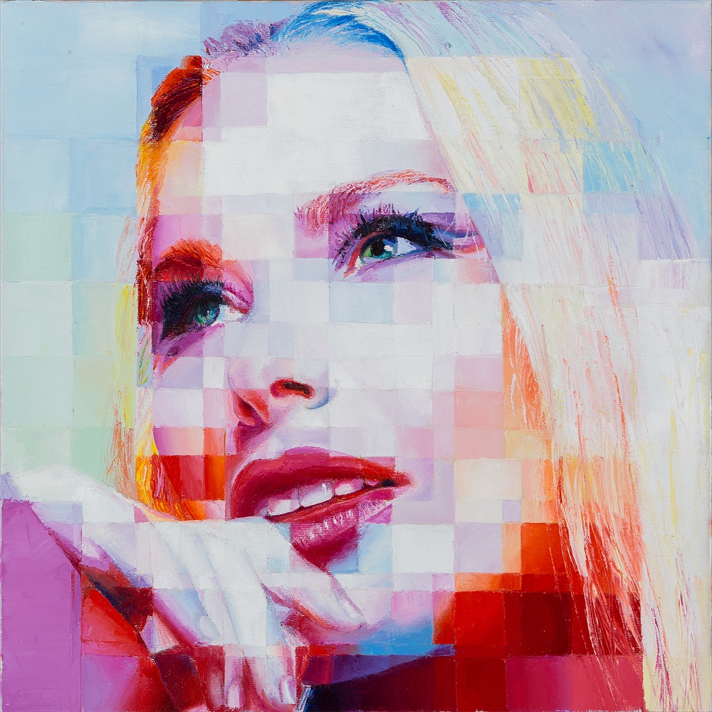
In my painting Playful Seduction, magenta weaves between skin and lips. It doesn’t ask permission—it breathes. It’s bold, alive, seductive. It transforms detail into vibration, gesture into pulse.
Artists like David Hockney have used it in their vivid synthetic landscapes, while Andy Warhol practically made it a signature of his pop aesthetic.
And yes…
I love magenta so much that, for a while, I wore it in my hair too.
It wasn’t just an aesthetic choice—it was a way to feel connected to my palette, as if the color could live beyond the canvas.

🔹 Caesar Purple – The Warm Shadow
Purple is a color that doesn’t shout but makes itself heard. I use a modern, luminous version in my palette: Caesar purple. It has the elegance of imperial purple, but with a lighter, contemporary spirit.
For centuries, purple symbolized absolute power: in ancient Rome, it was extracted from the rare murex shell and reserved for emperors. A gram was worth more than gold. Today, its symbolic charge remains, but I prefer to use it to express emotion, not authority.
")
I love pairing it with yellows and oranges—they create a chromatic tension that holds the viewer’s gaze. A visual vibration I always enjoy exploring.
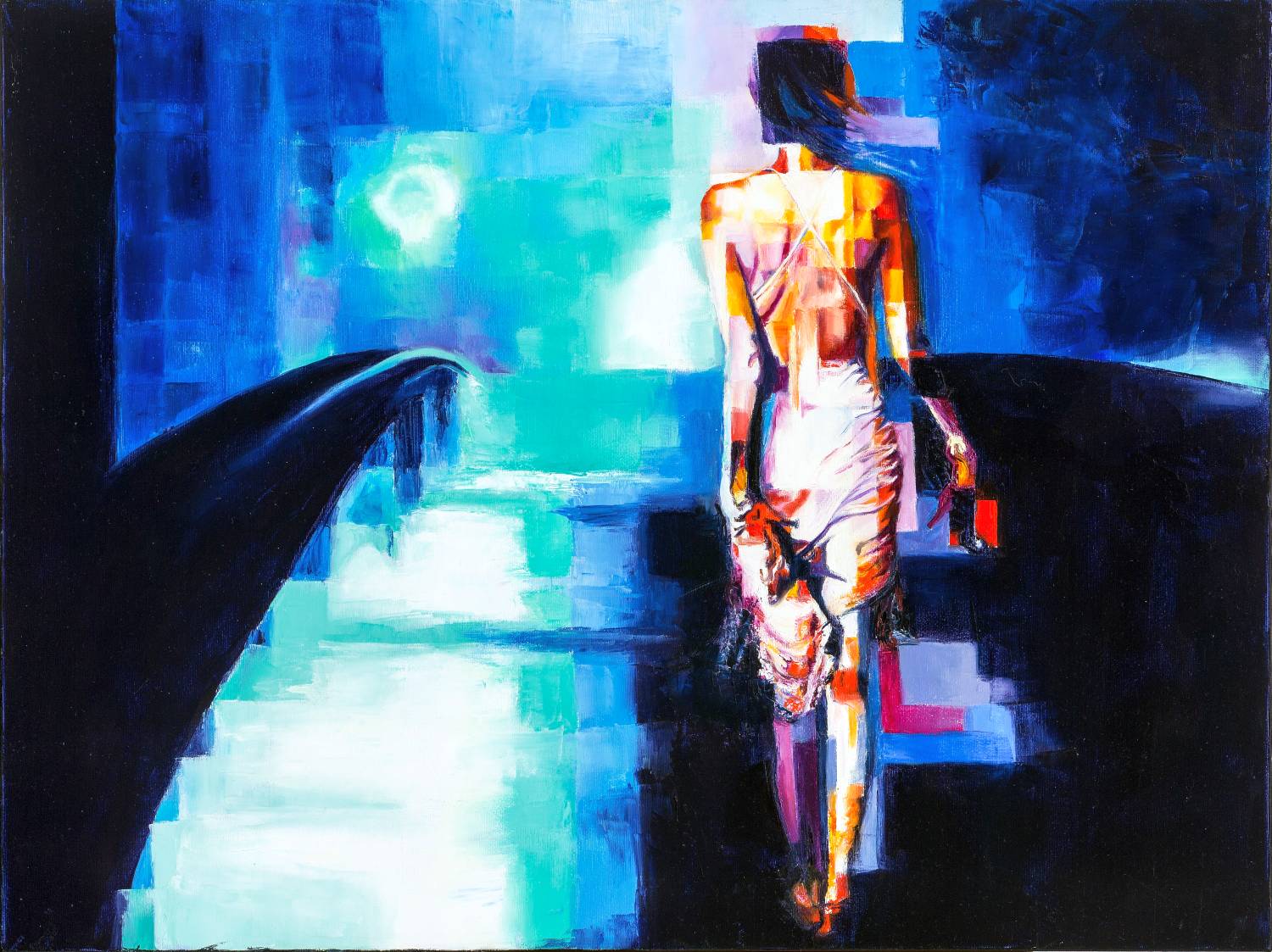
In Iloveyou Caesar purple vibrates between bodies and urban architecture. It lives between desire and melancholy, like a stage actor entering silently yet changing the entire atmosphere.
In art history, Klimt used it to evoke sensuality and mysticism, while Mark Rothko made it the absolute protagonist of his meditative canvases, charged with spiritual depth.
🔹 Violet – Emotional Oscillation
Violet is the color of the invisible seeking form. I use it to suggest silence, depth, a barely-there presence.
Cobalt violet has a curious story: discovered by accident in the early 1800s by a French chemist, it immediately captivated the assistant who tested it—so much so that he painted his entire house violet. The neighbors weren’t thrilled, but I, honestly, would’ve loved it!
I also use other shades of violet: lavender, plum, blue-violet tones… I don’t just look for them on the palette—I search for them in my painting, like waves collapsing into emotion—just like particles in a quantum field.
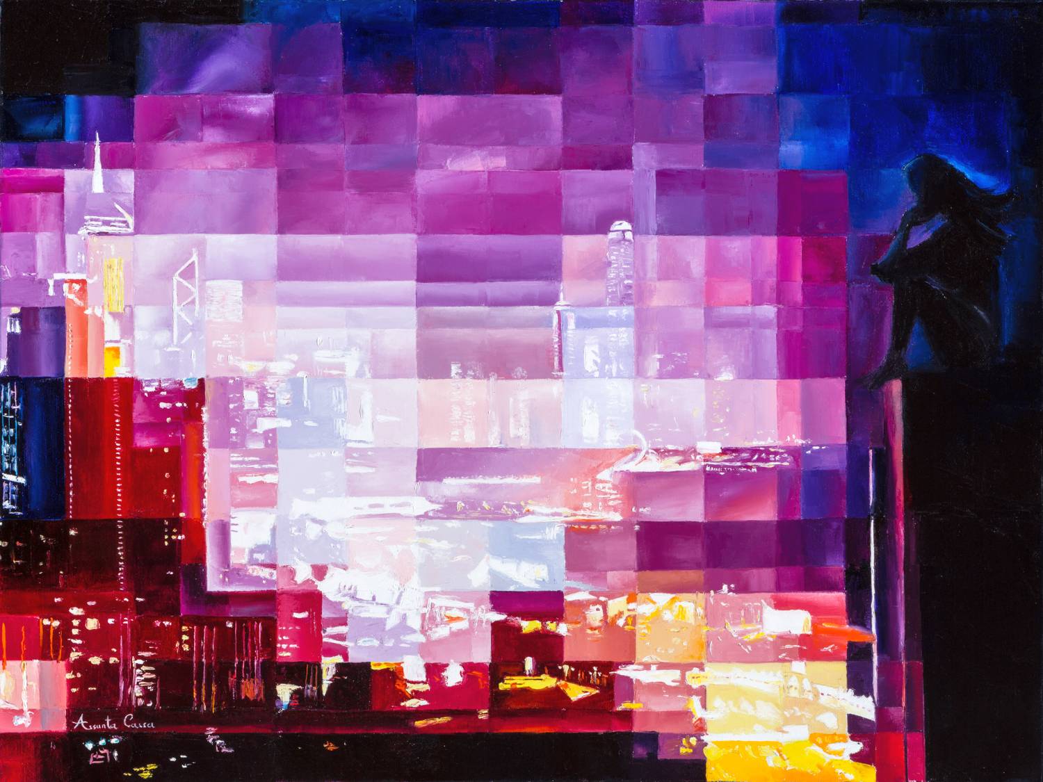
In Lacrima, violet becomes the breath of silence, the unsaid that keeps speaking, an emotional interference that crosses the scene like a whisper.

🎨 On My Canvas…
These colors are tools for expressing emotions that can’t be put into words.
Magenta to make things vibrate, purple to spark thought, violet to awaken intuition.
I don’t choose them to replicate reality but to suggest a presence, an atmosphere, a rhythm.
I barely mix them on the palette—I prefer to let them meet directly on the canvas. That’s where the magic happens.
✨ Want to see them come alive?
Discover my original works on Artfinder:
👉 www.artfinder.com/artist/assunta-cassa
Or explore more stories of color in my art blog.
And you? Is there a color you just can’t get out of your head?