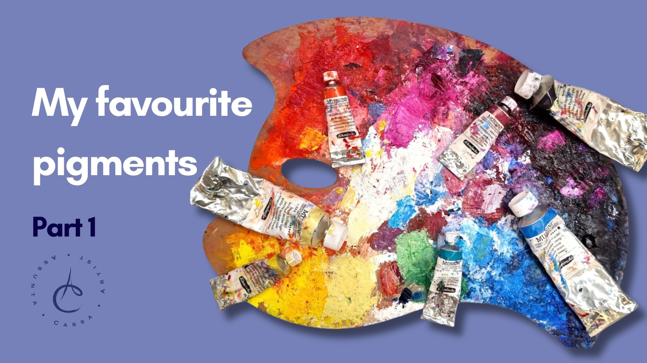
Colors are my voice. Pigments are the words I use to paint emotions, tell stories, and give shape to visions.
In this post, I invite you into my vibrant world to explore the favorite pigments that bring contrast, energy, and soul to my works.
🎨 Dark Royal Blue: Majesty and Depth
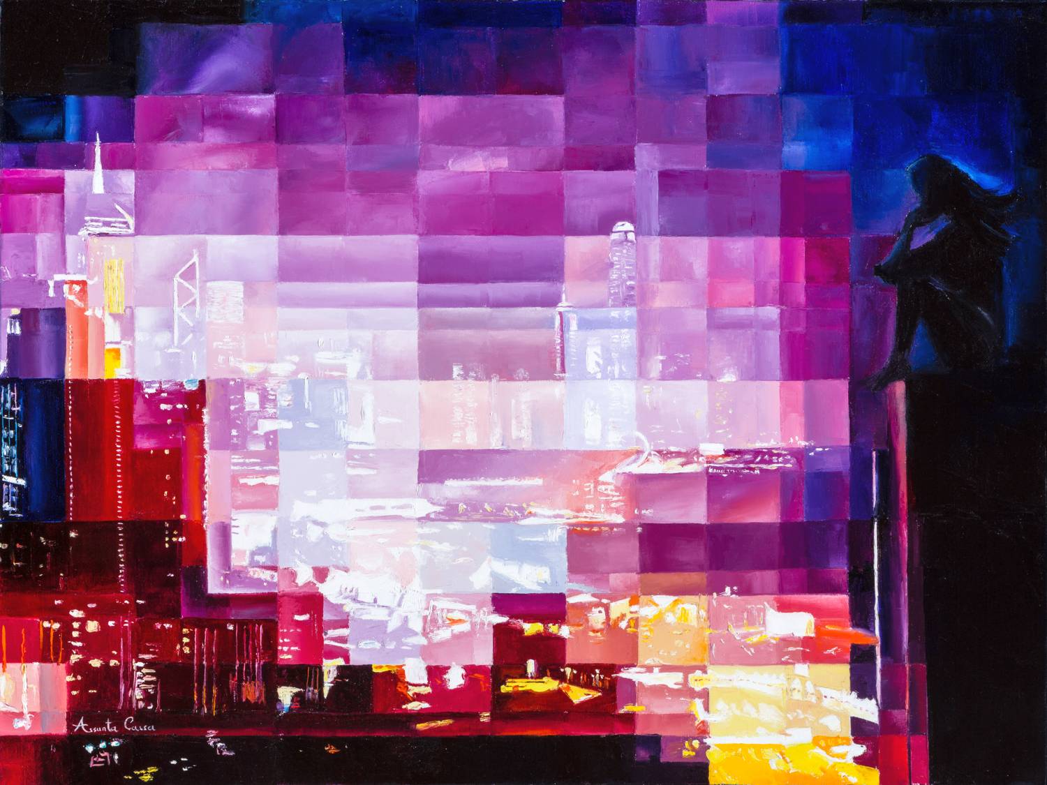
Let’s begin with dark royal blue—a color I return to again and again. This pigment reigns over my skies and seas. It’s deep, rich, and perfect for creating gradients that blend strength with serenity.

In Towards Jonathan Livingston, I used it with white and magenta to construct a visual continuum of sea, sky and concrete.
Royal blue leads the journey: depth, sky, and spiritual flight blend in a single palette.
💡 Personal Color Note
As a child, while many little girls adored pink, I was mesmerized by every shade of blue. It seemed unfair that boys “owned” my favorite color. Even then, I questioned gender stereotypes—and blue has remained my quiet rebellion ever since.
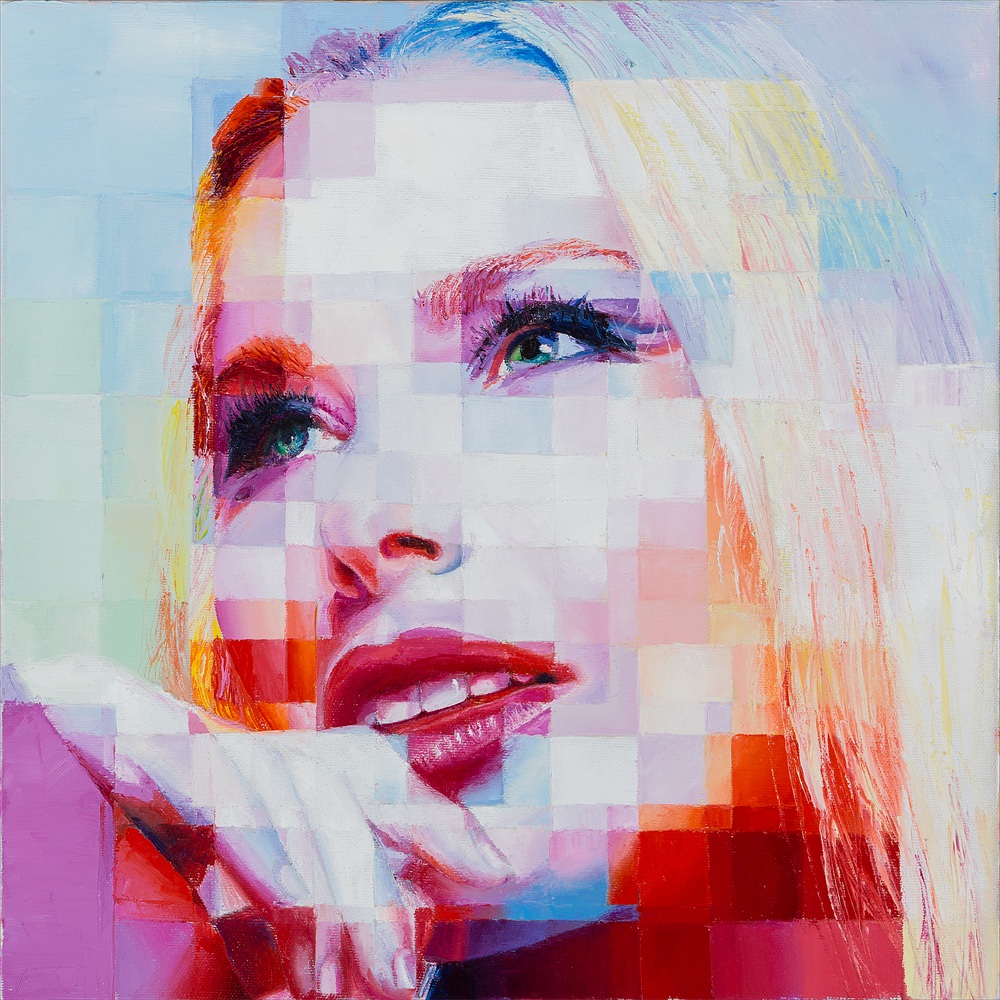
☀️ Bright Yellow & Cadmium Yellow: Sunlight in Paint
Bright yellow is pure energy, while cadmium yellow brings warmth and balance.
Together—especially when blended with white—they create a unique luminosity that I use to sculpt emotion and space.
In Jump into Life, these yellows reflect off the buildings and surround the figure in radiant light.
Bright yellow and cadmium yellow ignite the leap, infusing the urban scene with joy and energy.

❤️ Scarlet Red and Its Companions: Passion and Power
Scarlet red is all about presence. It commands attention and expresses intensity.
In Urban Elegance, I used it for the woman’s dress—a focal point in a cooler-toned cityscape.
A scarlet dress becomes the pulse of the city: elegance meets urban contrast.
I also turn to vermilion, with its classical warmth, and dark cadmium red, which adds emotional weight and shadows.
These reds, often blended with orange, magenta or Cesarean purple, bring depth and vibration.

🌫️ Payne’s Grey: Elegant Shadows
Payne’s grey is my silent anchor. Neither black nor blue, it’s a moody tone I use for contrast and atmosphere.
In Urban Connections, it defines edges and brings calm structure.
Payne’s grey frames the skyline, giving rhythm and gravity to the chaos of the metropolis.

🎨 Pigments as Identity
These favorite pigments reflect how I feel, think, and move through the world.
They are the royal blues of rebellion, the yellows of curiosity, the reds of presence, and the greys of silence.
They are pieces of me on canvas.
If you’re curious about the science and symbolism of color, Wikipedia has a great overview.
🧭 Stay Tuned for Part 2!
In the next article, I’ll explore the other colors I love, exploring their moods and meanings in my artistic world.
🎨 Because every pigment deserves its story.
📌 Want more color journeys? Discover My World in Colors: A Personal Journey
🌐 And explore my work on Artfinder